
Plus 30 Journal · Design / Lettering
Greece, letter by letter
From a bread shop sign to a digital typeface: the small forms that shape our reading of a city.
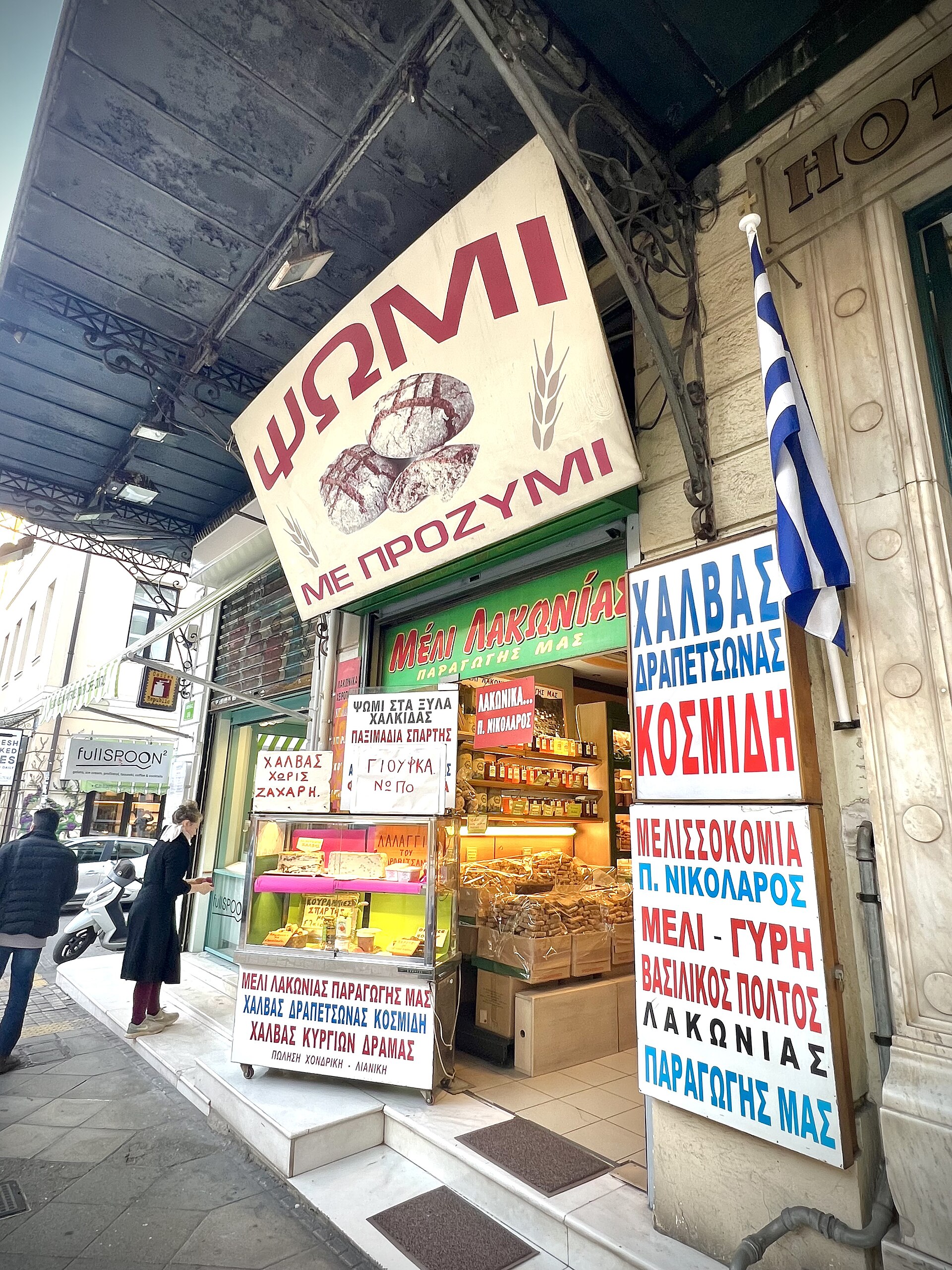
In this photograph, the word for bread catches the eye first. Four large Greek letters, a diagonal and a strong red are enough. Around them, other signs change size, weight and pace. The city holds an extensive collection of lettering that is easy to miss when we are busy reading only the message.
Pause, and the manner of speaking becomes visible too. Narrow letters fit a small board. A large capital asks to be read from a distance. Handwriting carries the movement of a hand. An ordinary word gains a particular voice through choices that might be professional, practised or entirely spontaneous.
The story continues on screen
Digital typography gives the Greek alphabet another field of careful work. Parachute introduced PF DIN Text in 2002, designed by Panos Vassiliou. Its supported scripts include Greek and polytonic Greek alongside other writing systems. A seemingly everyday tool contains decisions about how different letterforms can share a page.
The Greek Font Society follows a complementary path. Its work connects the history of Greek typography with digital type design, and its fonts are available free of charge with polytonic support. The digital format becomes a way to keep a writing tradition usable rather than simply preserve its appearance.
On your next walk, choose a word you keep seeing: coffee, bread, entrance. Notice how many different forms it takes. You do not have to identify the typeface. Look at a curve, a gap or the trace of a brush. Repeated attention to something this small can build a very personal visual archive of Greece, one that begins at street level and travels easily onto a page.